http://www.youtube.com/watch?v=MIERER2BEG4&NR=1&feature=fvwp
It's hard to find good student projects but this one I thought was pretty good. I love the song and the simplicity.
Saturday, April 23, 2011
Sunday, March 27, 2011
Teenage Angst slip case
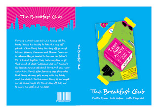
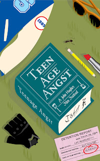
So I decided to make a pixelated portrait of John Hughes. I added art from each of the posters into the front of the slip case and modified the cityscape that I used on all the amaray covers. I used cyan and pink as the main colors because yellow can be hard to look at if your using light colors for the type and black was to heavy. However, yellow and black made great detail colors.
Tuesday, March 22, 2011
Amarays for teenage angst film fest
I changed the colors of the posters and a few things in each of the poster to make them a little more cohesive. Also I want to make a box that all the dvds fit into. That way on the back I can talk about John Hughes and the festival instead of having a synopsis for each movie.
Thursday, March 17, 2011
Tuesday, March 15, 2011
Teenage Angst: Round 2
Took forever to finish and they still need work.
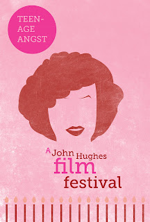
They are: 1) 16 candles
2) Breakfast Club
3) Ferris Bueller
They are: 1) 16 candles
2) Breakfast Club
3) Ferris Bueller
Tuesday, March 8, 2011
thumbnails for film posters
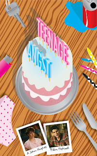
These are the ideas i think I'm going to use. I liked the posters I had before and if I have time I'll make them better. But these I think will be cool if I pull them off correctly. Strong use of color and hopefully tastefully done.
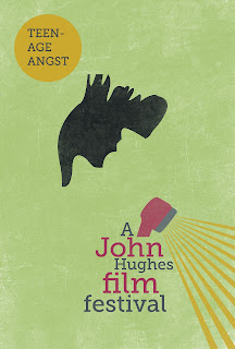
Oh I almost forgot to explain my ideas. I chose articles of clothing and essential parts to the movies that really stood out to me. It's been done before but I tried to include interesting angles and different ways to display the type on all three posters. Hopefully the illustrative style and color use will make the posters look like a package.
Oh I almost forgot to explain my ideas. I chose articles of clothing and essential parts to the movies that really stood out to me. It's been done before but I tried to include interesting angles and different ways to display the type on all three posters. Hopefully the illustrative style and color use will make the posters look like a package.
Monday, March 7, 2011
Sunday, March 6, 2011
teenage angst: a john hughes film fest 3
I showed my first version of this poster and everyone thought it was hard to tell what it was. So I had to add something to make the scene look more obvious. I think it looks better but I haven't resolved the shower head yet.
teenage angst: a john hughes film fest 2
Here is the breakfast club. Thought I'd go with the end of the movie scene you see in the beginning of the credits. It was either that or the one where the guys dance on the banister in the library. If your curious about the color palette I went with the colors He wore in the scene I represented and the lighter colors to match. The colors make me hungry like a sandwich made from type or something.
teenage angst: a john hughes film fest
I'm never a big fan of thumbnails so just to break up the boredom I made a poster. I thought "Coming of age," or "Adolescence" but they both sounded strange for my festival title. Hope you like it.
Thursday, March 3, 2011
John Hughes Film Festival
He was questioned during the eighties about making movies about teenage angst. However, as time went by, his movie's became cult classics and today he is known for acurately portraying the life of a teenager in such movie's as, "The Breakfast Club," "Sixteen Candles," and "Ferris Bueller's Day Off" just to name a few.
Wednesday, March 2, 2011
mtv bumpers:3
http://www.youtube.com/watch?v=O01E2IIhLmM&feature=related
They just keep getting better. For those of you that love cinema 4d.
They just keep getting better. For those of you that love cinema 4d.
mtv bumpers:2
Check this one out done by some students. Pretty awesome! http://www.youtube.com/watch?v=3aEz7oMC0mU&NR=1
mtv bumpers
http://www.youtube.com/watch?v=z7pNrWTFhJ8
I'm trying to get ideas for my mtv promo video. It's for motion graphics. I really like this style of illustration.
I'm trying to get ideas for my mtv promo video. It's for motion graphics. I really like this style of illustration.
Tuesday, March 1, 2011
Olympic two tone ad.
I was trying to go with a feel of a vintage poster but still use that modern illustrator look by keeping details to a minimum. I used photoshop as well to add some grain. I thought it help make all the elements in the poster blend well. I'm also a big fan of this style.
Wednesday, February 23, 2011
Olympic Bus Wrap
I took a lot of care making sure that I used a clipping mask on this thing properly. It was a little tricky but I think it came out well. I always have trouble keeping things simple. I think that was the trouble I had making my first logos digitized. But I think having to design so many things for the Olympics has really helped me learn how to create an identity and make everything look cohesive.
Olympic Bus Wrap: Flat version
As you can see between the bus wrap that I actually used and the one here I changed a few things around. I didn't realize the first time around that the wheels would create such a problem. However, it is fun to try and create something that looks good with such a restriction.
Tuesday, February 22, 2011
Olympic Billboard: #2
This was suppose to be a bus wrap but it wasn't working quite well. But I thought it would make for a nice billboard. Besides, now that I think about it my first billboard was kind of an old redundant style using blending as a transition. Hope you like this one better.
weekly blog: Alex Varanese
As a student and admirer of other designer's work I frequently look at professional portfolio's to get inspiration. I think I get a lot better at design when I look at tons of it. I get more ideas and most of all I can start to break down what programs or methods are being used to create different elements in pieces of design or illustration that I really like.
This is Alex Varanese. I first saw his work in a tutorial in the magazine entitled "Advanced Photoshop."
He's really good with type and his color scheme is reminiscent of Shepard Fairey. This particular piece was created for a microbrewery in Brooklyn that is on a mission to create the perfect beer. It was displayed in Playboy. And the article was called "Beer Wars."
Thursday, February 17, 2011
Olympic Billboard: revised
This time I wanted to add the type choice I used for my stationary and use some of the elements from my logo. I used a motion blur to create a transition between the mountains and the duotone of Munich.
Tuesday, February 15, 2011
Olympic logos: Finalized
I'm glad that I was able to keep the mountain and the crest. It was a cool idea to combine the two. Thank you Joe. However, I was a little disappointed when changing my color scheme to pantone colors because some of the colors I'm using are a little off.
All in all, I think it came out well. I was trying to stray away from the typical Olympic logos and create a simple almost retro feeling logo. Without looking dated.
I used the mountain to represent the Alps, the Crest to represent the cities old architecture, the type was an attempt to be somewhat "Bauhaus." I think I coined that phrase. And the color scheme was to make it a little more winter feeling without having to say it.
Olympic logos: Digitized
I like the Flag with the hexagon around it and the Mountains. I think the color scheme on the crests on the blue and green ones are the best.
Olympic Research: Munich, Germany
Munich is the third largest city in Germany, after the cities Hamburg and Berlin. The city hosted the 1972 Summer Olympic games and is a possible candidate for the 2018 games which I am designing my logo for.
The city's motto is "Munchen mag Dich." Which roughly translates to "Munich Loves You." And the name of the city in German, "Munchen," means "by the monk's place. This is because the city was founded by monk's which is also why their is a monk depicted in the city's coat of arms. On the Munich flag are checkers, black and yellow.
Near the city is the Bavarian Alps, Europe's largest mountain range, which runs from the eastern european countries (Austria and Slovenia) all the way through the western countries (Germany and France).
During the early 1930's, Munich was a Nazi stronghold and suffered from several bombings. Many of the structures including some of the older buildings dating back to the 17th century had to be restored. During that time the city, was considered the "Capital of the Movement" and bared "Fuhrer" buildings which were buildings that were associated with the nazi party.
Sunday, February 13, 2011
Olympic Logos: Sketches
Munich, Germany is one of the possible candidates for the 2018 winter games. I wasn't aware of this until I began drawing. When I realized that, I decided to go with Winter just because I was curious to see how different my logo will be from the one they choose for Munich.
I also chose Germany because of it's art and architecture. I loved the Bauhaus period, I love black letter type, and gothic architecture. I also, as of recent, have begun to really appreciate German Expressionism. I went to LACMA a few semesters ago and new I would do some graphics that were inspired by this particular type of art.
I also chose Germany because of it's art and architecture. I loved the Bauhaus period, I love black letter type, and gothic architecture. I also, as of recent, have begun to really appreciate German Expressionism. I went to LACMA a few semesters ago and new I would do some graphics that were inspired by this particular type of art.
Subscribe to:
Posts (Atom)
