Sunday, March 27, 2011

Teenage Angst slip case

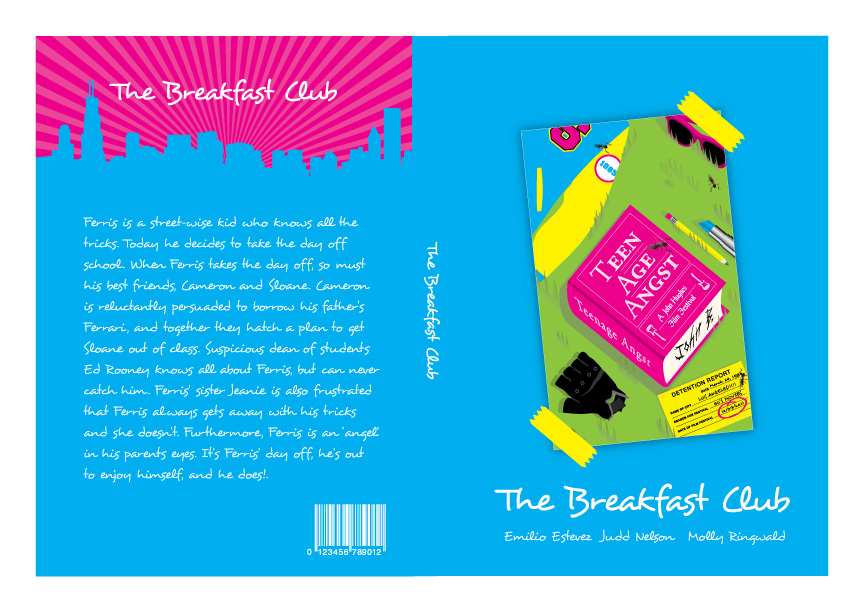
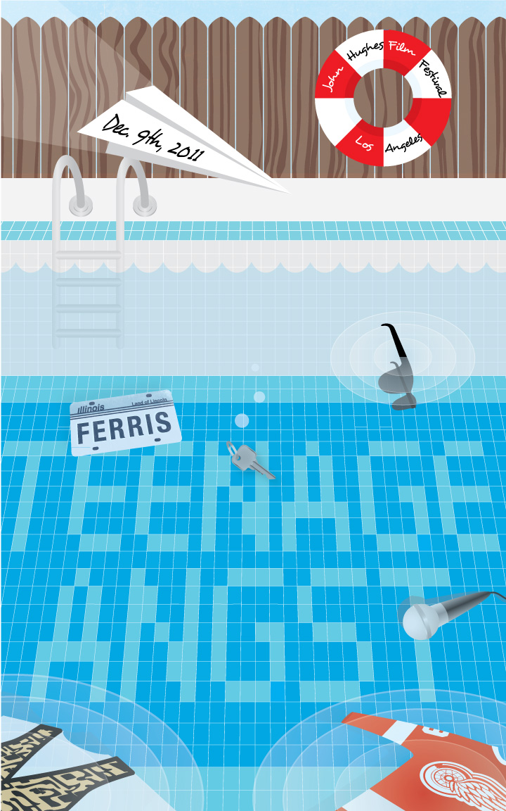
So I decided to make a pixelated portrait of John Hughes. I added art from each of the posters into the front of the slip case and modified the cityscape that I used on all the amaray covers. I used cyan and pink as the main colors because yellow can be hard to look at if your using light colors for the type and black was to heavy. However, yellow and black made great detail colors.

Tuesday, March 22, 2011

Amarays for teenage angst film fest


I changed the colors of the posters and a few things in each of the poster to make them a little more cohesive. Also I want to make a box that all the dvds fit into. That way on the back I can talk about John Hughes and the festival instead of having a synopsis for each movie.

Tuesday, March 15, 2011

Teenage Angst: Round 2

Took forever to finish and they still need work.
They are: 1) 16 candles
                2) Breakfast Club
                3) Ferris Bueller

Tuesday, March 8, 2011

thumbnails for film posters

     These are the ideas i think I'm going to use. I liked the posters I had before and if I have time I'll make them better. But these I think will be cool if I pull them off correctly. Strong use of color and hopefully tastefully done.
     Oh I almost forgot to explain my ideas. I chose articles of clothing and essential parts to the movies that really stood out to me. It's been done before but I tried to include interesting angles and different ways to display the type on all three posters. Hopefully the illustrative style and color use will make the posters look like a package.

Sunday, March 6, 2011

teenage angst: a john hughes film fest 2:redo

teenage angst: a john hughes film fest 3

I showed my first version of this poster and everyone thought it was hard to tell what it was. So I had to add something to make the scene look more obvious. I think it looks better but I haven't resolved the shower head yet.

teenage angst: a john hughes film fest 3

ferris bueller. Too many ideas for this one. It was hard to narrow it down.

teenage angst: a john hughes film fest 2

Here's the replacement. It was missing something.

teenage angst: a john hughes film fest 2

Here is the breakfast club. Thought I'd go with the end of the movie scene you see in the beginning of the credits. It was either that or the one where the guys dance on the banister in the library. If your curious about the color palette I went with the colors He wore in the scene I represented and the lighter colors to match. The colors make me hungry like a sandwich made from type or something.

teenage angst: a john hughes film fest

I'm never a big fan of thumbnails so just to break up the boredom I made a poster. I thought "Coming of age," or "Adolescence" but they both sounded strange for my festival title. Hope you like it.

Tuesday, March 1, 2011

Olympic two tone ad.

I was trying to go with a feel of a vintage poster but still use that modern illustrator look by keeping details to a minimum. I used photoshop as well to add some grain. I thought it help make all the elements in the poster blend well. I'm also a big fan of this style.